Devlog: UI Assets Direction and Navigation Functionality
For my prototypes, I decided to explore UI assets and navigation. Social Circle, as of this time, is meant to be a game designed for mobile. For mobile games, UI design is one of the most important aspects, as it is an element in the game that the player constantly utilizes. Knowing this, I wanted to investigate UI elements of the mobile space to get a better idea of which designs/layouts are user-friendly for the player.
I created 2 prototypes, one for asset creation and the other for navigation. The process of creating these prototypes were interconnected, so I will be talking about my findings in both of them in the same devlog.
UI Assets Unknowns
Unknowns:
- Which UI assets take up the most time to design?
- Which ones are most appealing?
- Which assets match the overall mood and tone that the team would want to go forward with?
Process:
To answer these unknowns, in my sketchbook, I created multiple buttons that came to mind. In our game, the player is meant to balance out 4 different activities to take care of a pet, so I experimented with 4 types of buttons per “set style”.
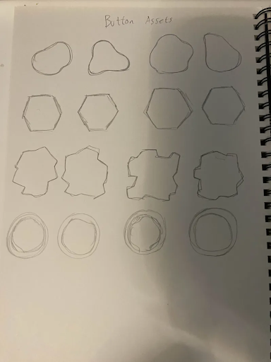
Image of quick sketch ideas. Anything that came to mind!
As I was brainstorming which styles to go for, I realized how flexible UI buttons can be. There were either 2 ways I could go with button sets: make them all unified or make them asymmetrical. During sketching, it seemed like I was unconsciously creating asymmetrical button sets.
I decided to go forward with these 4 button sets and plugged them into Illustrator to iron out which designs took the longest to create and which ones looked more appealing in a better version. This step would give me a better sense of which styles are within my scope and workload I can take if I go forward with certain styles.
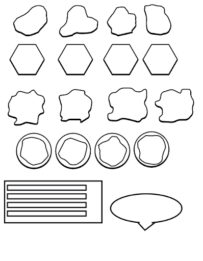
Buttons and other assets made in Illustrator
After creating these buttons, I concluded that:
- The bubble buttons looked the most appealing and had more freedom with the way I created them
- The squarish sharp buttons were the lengthiest ones to create, and in my opinion, looked the most unappealing for our game
- The hexagon buttons were the easiest to create due to them being the same shape
Process Continued – Bringing the button styles to life
With these rough assets created, to make it easier to decide what style to go for, I decided to create a google slides display “presentation demo”, to show my teammates their opinions on these styles.
Before the creation of the presentation demo, I sketched out multiple potential layouts with buttons. After looking at references similar to our games using Miro, I sketched layouts inspired by them. This process was also helpful in prototyping the navigation unknowns, which I will discuss later on in the Devlog.
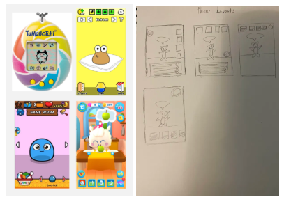
Left Image: Reference board with mobile games I found that also had elements of taking care of a pet. (Tamagotchi, Pou, My Boo: Virtual Pet Simulator, My Tamagotchi Forever)
Right Image: Layouts I created in my sketchbook
From my sketches, I created the Google Slides Presentation, with different buttons for each layout. To save time, I found stock images for each activity.
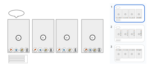
Images of the Presentation Demo in Google Slides
Using Google Slides was a quick way for myself to compare the layouts side by side, as well as showing it to others. This strategy helped reduce the amount of time switching between files. Doing this process also helped me see which potential button styles were the most flexible in layout spots.
Evaluation
I tested this prototype internally with my teammates. My teammates seemed more fond of the bubbly buttons. They also liked the 2nd option as well (Hexagons), stating that the 2nd option would be better if the button layouts were displayed on the bottom, but were still fond of the bubbly buttons overall for all layouts. In contrast, they felt the last 2 sets (Square shapes and circles with blobs inside) were the most unattractive.
After looking at all the layouts, the team was able to center down the visions of navigation feedback for the assets. We realized that one of the main aesthetics goals for the navigation feedback would be for the feedback to be bouncy and fluid, rather than blocky and static.
These buttons also helped discuss the overall style of the pet as well, and the animations that would go along with the pet, as we realized the UI and pet being unified would make the game more attractive.
Summary and overall things I learned
Overall, from this prototype, it taught me more about UI mobile layouts and styles. Button designs can have a big impact on the overall appeal depending on if they’re symmetrical or asymmetrical. Additionally, a busy button design is not always better. It can make the UI screen look busy and unappealing to users. Finally, I learned that the right asymmetrical button styles can make the design more intriguing while still making it easily readable for users.
UI Navigation Unknowns
Unknowns:
- What UI layout is the easiest to navigate?
- How should the game display the meters and bars? Which ones are the most readable?
Deciding to intertwine both navigation and UI asset processes, seemed like a “messy” way to develop prototypes at first, but since both aspects connected to each other, I thought: Why not use the findings of a past prototype, and develop it for another test? This process was something new to me as well, but it saved time and was beneficial towards this prototype.
In Social Circle (I’ll state it again), one of the main mechanics we decided as a team was to balance a bunch of stats based on the pet’s needs. These stats would be increased once the player does the specified activity with them.
Referring to the reference board and sketches I did earlier, I analyzed and looked at how these game references communicated certain wants to the pet for the player. One of the main takeaways I learned from this reference board was that all of them used:
- Iconography – Icons to not clutter the screen and make it more visually appealing
- Limited buttons – The main activities were the unique “stand-out pieces” of the layout
- Simplicity – Buttons did not fill the entire screen
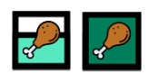
In these games, to fulfill those wanted activities, you would need to go to the certain room that matches the meter, by pressing an arrow button to advance to that area in order to finish the activity.
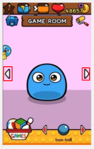
E.g. In the game My Boo: Virtual Pet, the player navigates to an activity room using the annotated arrow buttons.
I found the buttons of needing to scroll through rooms unintuitive, as I thought it created unnecessary buttons the players would need to press. To make it more simple, I decided to create a button where the navigation is built into the icon meter tracker, in hopes that it would make it more simple and less clutter for the player.
Wireframe prototype
Using Figma, I created a quick mock-up displaying a random UI layout with the buttons on the screen. This prototype was more focused on navigation and readability, so I did not focus much on the aesthetics of how the buttons looked in this case.
I chose any default UI layout that I created from the last prototype, with the same stock images I found before. Since this prototype was more focused on navigation, I decided to create simple buttons, to focus on one unknown at a time.
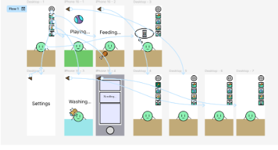
Figma Prototype displaying the interactions between buttons.
Showing the Prototype
When the wireframe was done, I showed it to potential players. The players I looked for matched the age group our team was targeting for this game. During the prototype, I would ask them to do a task, and ask them questions about the overall functionality and aesthetics of the buttons and navigation.
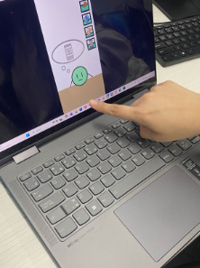
Playtester trying the Prototype.
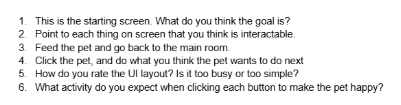
Questions I asked the play tester during the prototype.
Playtest Results
When playtesting the wireframe, the play testers were able to complete the tasks I asked. During the questioning section, I was able to gain some valuable insight on the navigation being built into the meter. I wrote down any observations and trends:
- They knew the goal was to manage a type of creature
- Play testers knew the meter was interactable, but did not realize it was changing the stats once they completed an activity
- Many thought the UI layout was too simple, as many stated the area felt too empty
- Some suggested that the buttons were too close to each other
Figma button meter bar change in the Wireframe. Many players did not notice the green meter at the back filling up once going back to the main menu.
There were others ideas brought up during playtesting as some play testers suggested:
- Wanting more interactions with the pet
- Simple motions to complete an activity (Drag the food to feed the pet, scrub the pet to make it clean, etc)
Evaluation
A common finding was that many people thought the UI was too simple, while at the same time hard to understand. Many new risks come up for the UI layout for our game. In particular, it brings up unknowns/questions of which ways are best to display the stats of the pet:
- Appeal → Since we only have four activities, how do we fill the screen without making it look too empty for players? Is a separate meter necessary to display the needs for the pet? What are other ways we could display this?
- Usability → Are there any other ways to switch activities, without the need to scroll through rooms, much like the references I found in this prototype?
Summary and overall things I learned
In summary, during this prototype, I learned that simplicity in mobile UI is important, however, if it is too simple, it may cause the screen to look empty. To add on, assigning a singular interaction to have multiple functions (e.g. Shown in my prototype: navigating to activities while keeping track of the pet’s stats) can make the user unaware of its multiple tasks it fulfills. I realized during this prototype that creating a UI for mobile has a lot of hidden complexity.
As per my skills, I was able to take this opportunity and use an application I have not used often, which was Figma. For wireframes, I usually use slide deck software, such as PowerPoint or Google Slides. But for this prototype, I wanted to dip my toes into a software I did not know much of, as I learned Figma has more options.